I’m a massive Star Trek fan. So I’m super-excited that Jorge Almeida took some time to discuss his work on Star Trek Into Darkness — for which he was the lead designer of the UI elements. (If you’re paying attention you’ll remember this previous post with Jorge on his work for MI:4 and The Dark Knight Rises).
Q: How did you get involved with Star Trek Into Darkness?
OOOii (pronounced “ooh-wee”) created all of the user interfaces for the first film, so we were brought on to continue our work on the second. I had done some UI work on “Star Trek”, and was asked to take the lead on “Star Trek Into Darkness.” I got a chance to see the movie on Sunday. Just a great ride. I am really proud to have been a part of this film. Hopefully fans will like what we did.
Q: What was your role? Were there a lot of others involved in the design and production? What software did you use?
I was lead designer for OOOii. I oversaw the look and animation style for all of the UI in the film. We had a great team, with major contributions from Blaise Hossain, David Schoneveld, Paul Luna, and Andrew Tomandl. I also need to single out Rudy Vessup, who was my right hand man on this job. Just a fantastic motion graphics artist and a real pro.
Everything we created was done using some combination of Adobe Illustrator, Photoshop, and After Effects. Additional 3d elements were created using Maya.
Q: Was there a general design brief or design direction that you were given? What were your design influences?
For the Enterprise, production already had the full set of interface animations we created from the first film, so we were only responsible for additional UI specific to the story. It was therefore important that I maintain the style and the spirit of what was done in the first film.
Scott Chambliss was the production designer, and I loved what he did with “Star Trek.” The look of that film reminded me of some of Frank Frazetta’s classic Buck Roger’s illustrations. I would always keep that style in mind when designing. I’m also a fan of the classic LCARS interface from “The Next Generation.” While production wasn’t looking for a revision of LCARS, the curved corners and elegance of those interfaces definitely had an influence on my work.
We also had the advantage of having seen the first film and how it was cut. The action often moves quickly, so the UI had to communicate story points clearly and efficiently. When you’re spending days or weeks on a shot, it’s easy to forget that it may only be onscreen for less than two seconds.
Q: Can you describe the work that went into the UI development for the starship Vengeance?
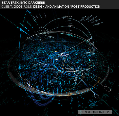
Early on, there was a focus placed on the starship “Vengeance.” They were shooting the Vengeance towards the end of the schedule, but Scott wanted to get a clear direction before production started and other priorities took over. He provided us with some imagery to use as inspiration- most of it pretty abstract, but the shapes definitely felt interstellar. There were many overlapping circles, and cloud-like clusters. They reminded me of some of the space station research I had done. I presented him with ideas and he started to narrow it down from there.


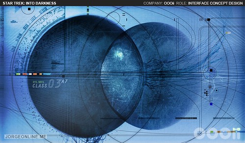

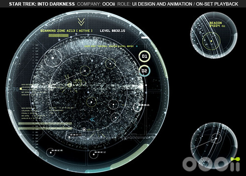
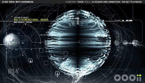
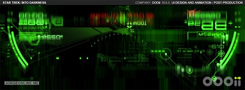
The “Vengeance,” like the “Enterprise,” featured 4 sets of monitors that wrap around the top half of the bridge walls and act as a 360º radar monitor. Some of the images Scott had provided us felt like nautical maps, so I kept that in mind when coming up with ideas. Thinking of the monitors as windows of a submarine, I tried to make what was happening outside feel slightly ominous and alive.


Once we started testing the animations on set, Scott asked us to desaturate them quite a bit so that they would blend in better with the black interior. I really liked the effect. Here are some of the finals (the viewscreen was done in post):

Q: There’s some really interesting heads-up display work. What was involved in their design?
All of the heads-up display shots were obviously done during post-production, so we worked under the direction of Visual Effects Supervisor Roger Guyett. We presented our work regularly to Roger and VFX Producer Ron Ames for comments, and eventually they would present our work to JJ.
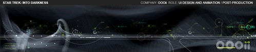
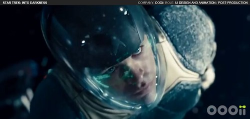
The entire space jump sequence was definitely a highlight for me. It was obvious from the first edit I saw that this scene was going to be a lot of fun. We were asked to create the UI for the viewscreen, the glass panel display, and for the helmet heads-up display.
My goal with the HUD was to minimize the interface as much as possible. I wanted to frame it around the actors face in a way that didn’t feel too tech. I was trying to make it feel soothing, with a steady pulse- that way the animation had somewhere to go when things get dangerous.


The projected flightpath was something they had as a rough concept in their original edit, so I just took it from there. I had seen some POV video of an olympic luger, and thought it had the right rhythm and movement to use as a starting point for the animation. I showed our 3d artist the videos, as well as some sketches I had done, and he started building elements in Maya. He rendered a variety of frames and I started combining them in photoshop until we came up with a style that production liked.

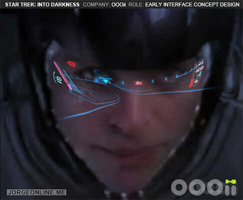

From there, it was a matter of animating the individual shots. I animated all of the shots using After Effects. I would create the animation, then put together rough comps so Roger and JJ could see the graphics in context. Once approved, I provided the flat HUD graphics as separate passes for ILM so that they could have flexibility when doing final compositing. The whole process went pretty smoothly.
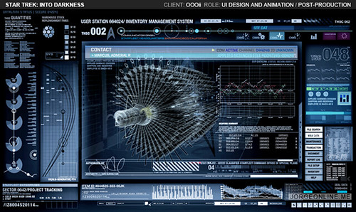
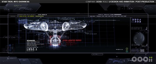
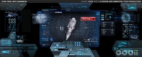
Q: How did you approach the Enterprise viewscreens?
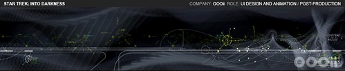
One of the major challenges in post was designing the Enterprise viewscreen interface. There were only one or two viewscreen interfaces in the first film, but in “Star Trek Into Darkness” there were several. The obvious challenge was keeping the look consistent with the rest of the bridge. Like Scott, Roger also wanted to avoid any design that felt too grid-like or text-heavy.
I don’t really have a set process for how I work. Sometimes I draw thumbnails, sometimes I just start throwing elements onto a photoshop or ae file and start mixing and matching. Generally my philosophy is to keep fixing it until it breaks, then take it back a step. I heard Iain McCaig say that in a video once. Made sense to me.
In practical UI, you are trying to give the user an elegant way to make choices. With film UI, I am trying to give the viewer the illusion of choice. I am trying to deliberately direct the viewers eye to whatever story point the director wants revealed at the time he wants it revealed. The job becomes more about illustration, especially in post where we can see how the interface is framed within the shot. We paint a small part of a much bigger picture, and our work needs to visually support what’s on screen so that we don’t disrupt the rhythm of the viewing experience.
One technique that I often use is to design in greyscale (using an adjustment layer). It reduces the composition to it’s basic values so that I can design without being distracted by color. We also often use Adobe bridge to review various concepts and composites at thumbnail size. It’s an easy way to see which designs are the most effective.
The viewscreen for the volcano sequence was one of the first priorities we had, so the developmental process took place with that interface. I began with thumbnail sketches and tried to work out compositions both on paper and in photoshop.


The volcano viewscreen quickly exposed an issue with trying to make the design too nonlinear — that we might lose the distinction between what was being projected on the glass and what was floating behind it. The view screen needed some type of framing to visually attach it to the ship and easily distinguish it from the environment. We had used translucent glass panels as border elements in the first film, so I started enlarging and reconfiguring them to break up the shape of the viewscreen. I then added and rearranged graphic elements within that framework until the interface had a balance between design and functionality that everyone was happy with.


Once the first couple of viewscreens were approved, the look took off from there. We provided the elements to ILM in separate passes so they could make adjustments and dial in the final composites with Roger and JJ. ILM, as always, did a fantastic job. I couldn’t be happier with how our graphics looked onscreen.


Q: Any final thoughts?
“Star Trek Into Darkness” did a lot of shooting in Los Angeles, so I was much closer to this production than I have been on any film in a while. We were on set a lot, so I was reminded first-hand of just what an enormous operation film production is. Multiple sets being built simultaneously. Trees being painted red on one stage, and a giant Starfleet shuttle on the next. I was humbled by the tireless efforts of our producer, Jennifer Simms, as well the playback producer Cindy Jones. They took on many of the headaches of the job and helped facilitate the constant flow of information between our team and production. This is not easy when you’re talking about creative notes one second, detailed technical issues the next, and budget issues in between- all while this giant train is in motion.
I was also reminded of just how much we depend on the playback crew on set to make our animations work within a scene. We’ve worked with Monte and the guys at Cygnet Video for years. Aside from technical issues, they are also responsible for cueing our animations in sync with the actor’s movements. Ultimately, what you see on screen is an elaborate dance between a large number of people both onscreen and off. It’s pretty amazing to watch it all come together so effectively.
Thank you.
Thanks for the interest in our work. Hopefully people enjoy the movie as much as I did.
You can see more of OOOii’s work on their website oooii.com. And Jorge has posted more of his developmental stuff on his website: jorgeonline.me.